Client
Lagos International Market
Sector
Grocery & Supermarket
Scope of work
Strategy, Brand Identity Design
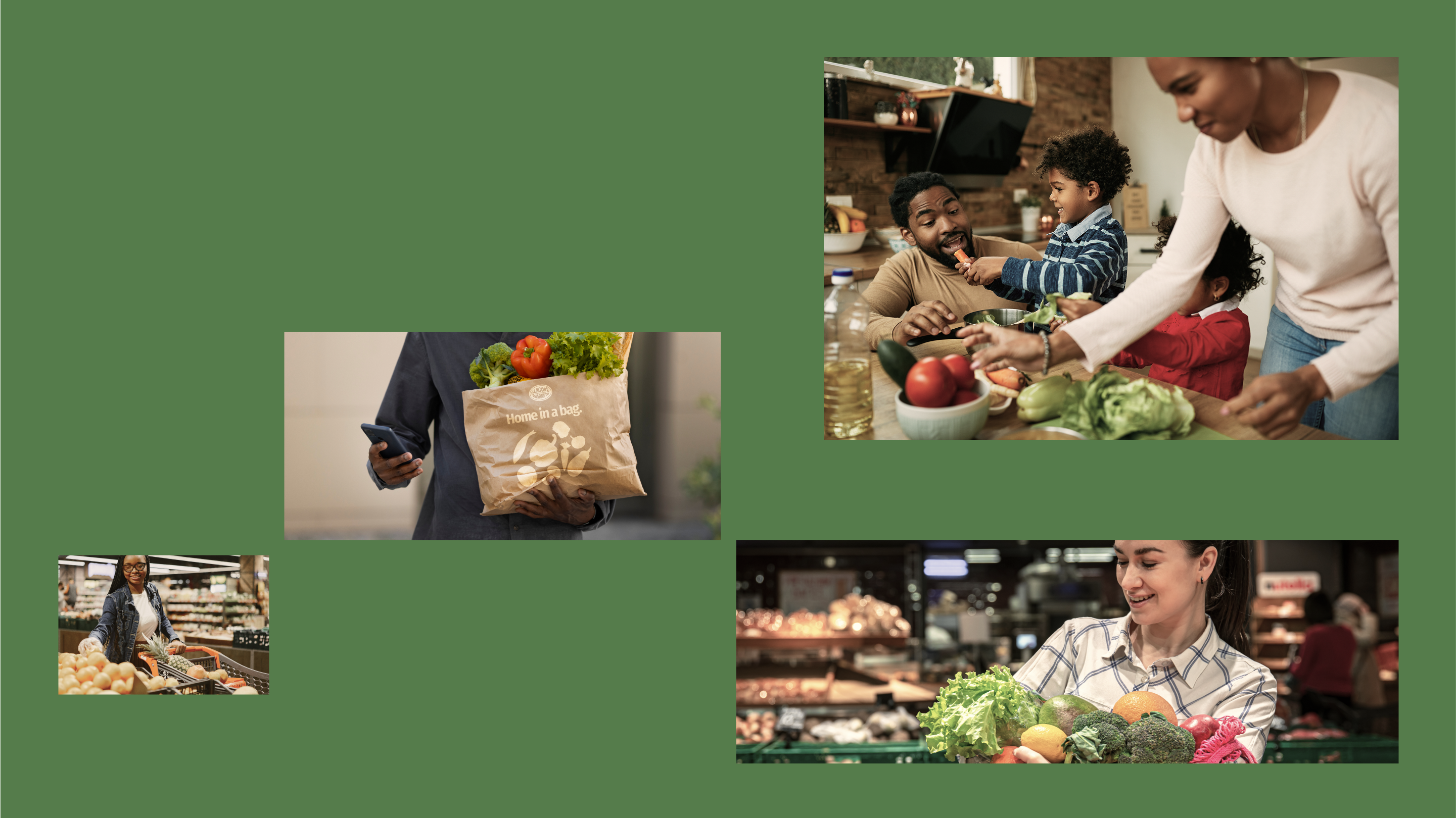
Lagos International Market was founded over 23 years ago by Adeboye and Seyi Ibrahim when they first came to America. As new immigrants, they experienced firsthand the struggle of finding authentic, local ingredients from home. The familiar spices, grains, and products that connected them to their heritage and culture. They understood the deeper challenge of adjusting to a new world and community here in America, where the traditional African support system doesn't exist and everyone is essentially OYO (on your own).
Strategy: The strategy was designed for longevity. While competitors focused solely on speed and convenience, Lagos
International Market built its foundation on something deeper. Their products are locally sourced, nutritionally balanced, and kind to people and the planet.
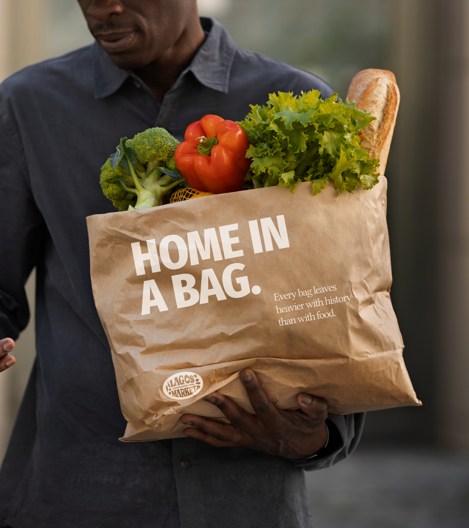
The Idea: Lagos International Market exists to be a true home away from home for diaspora communities
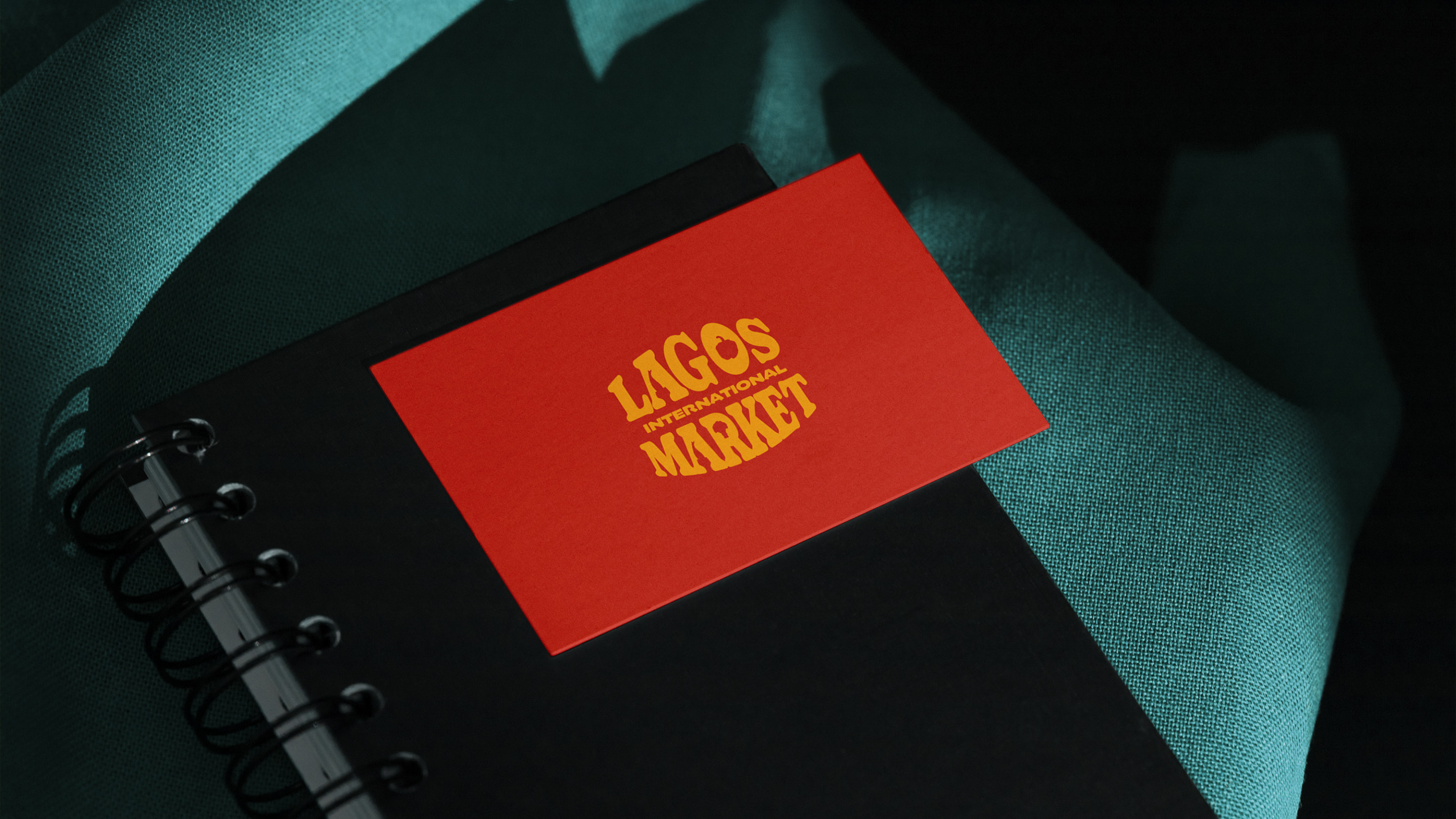
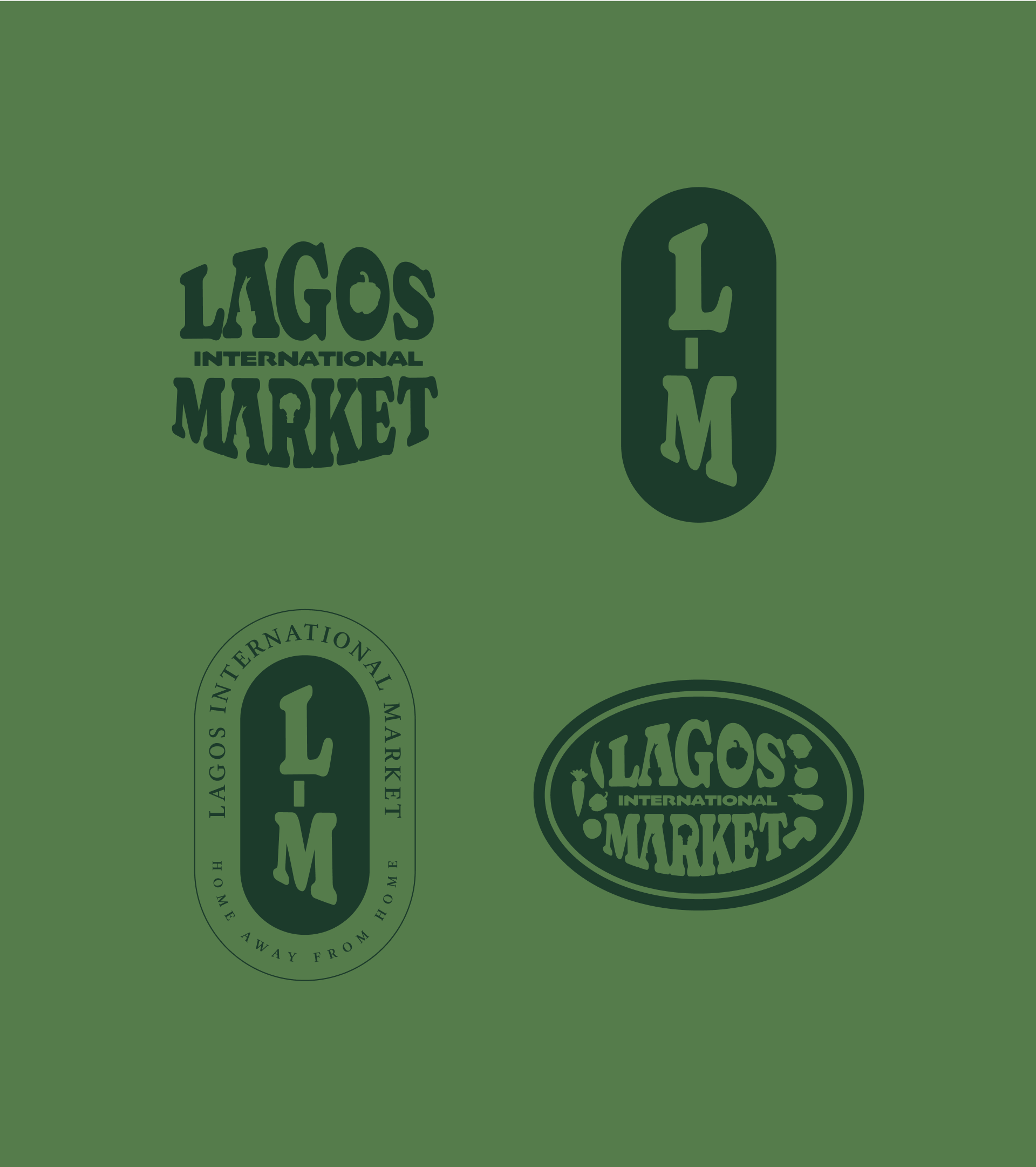
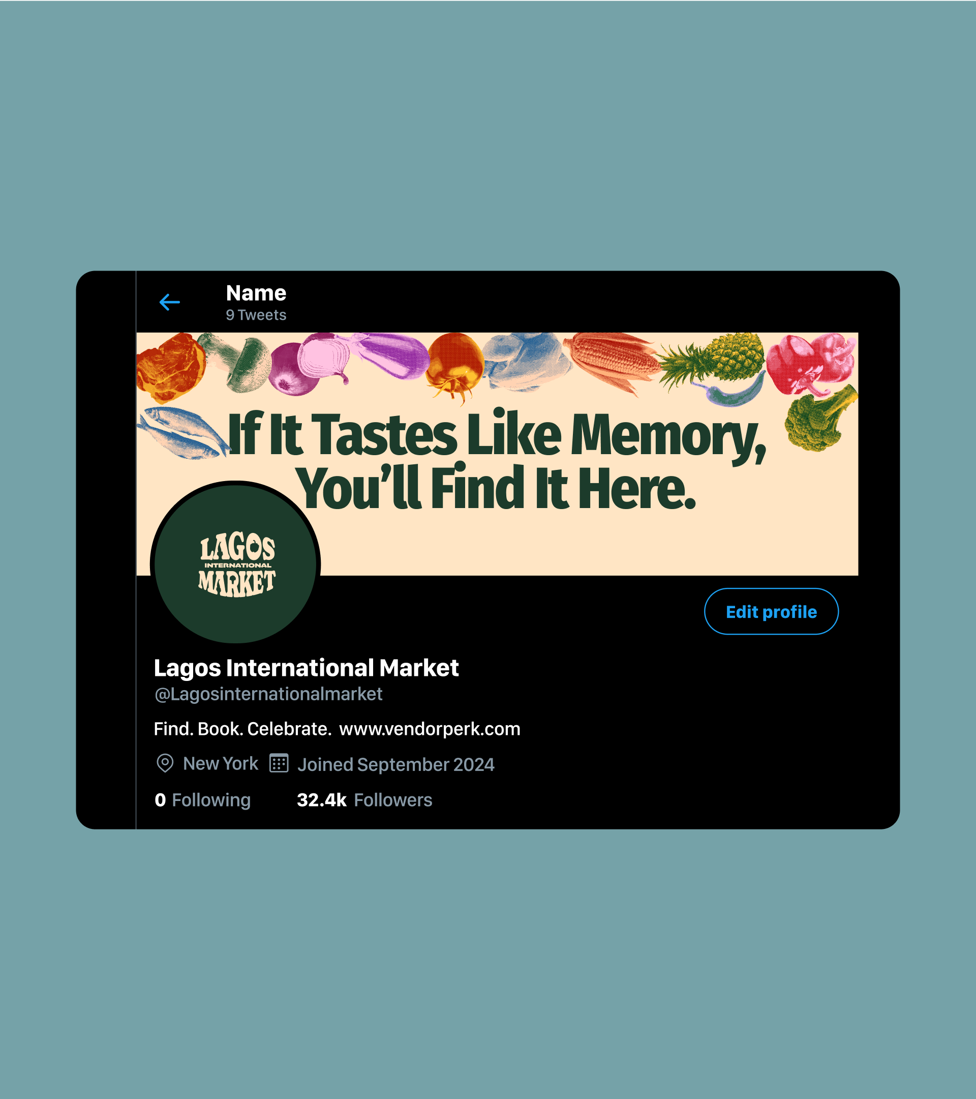
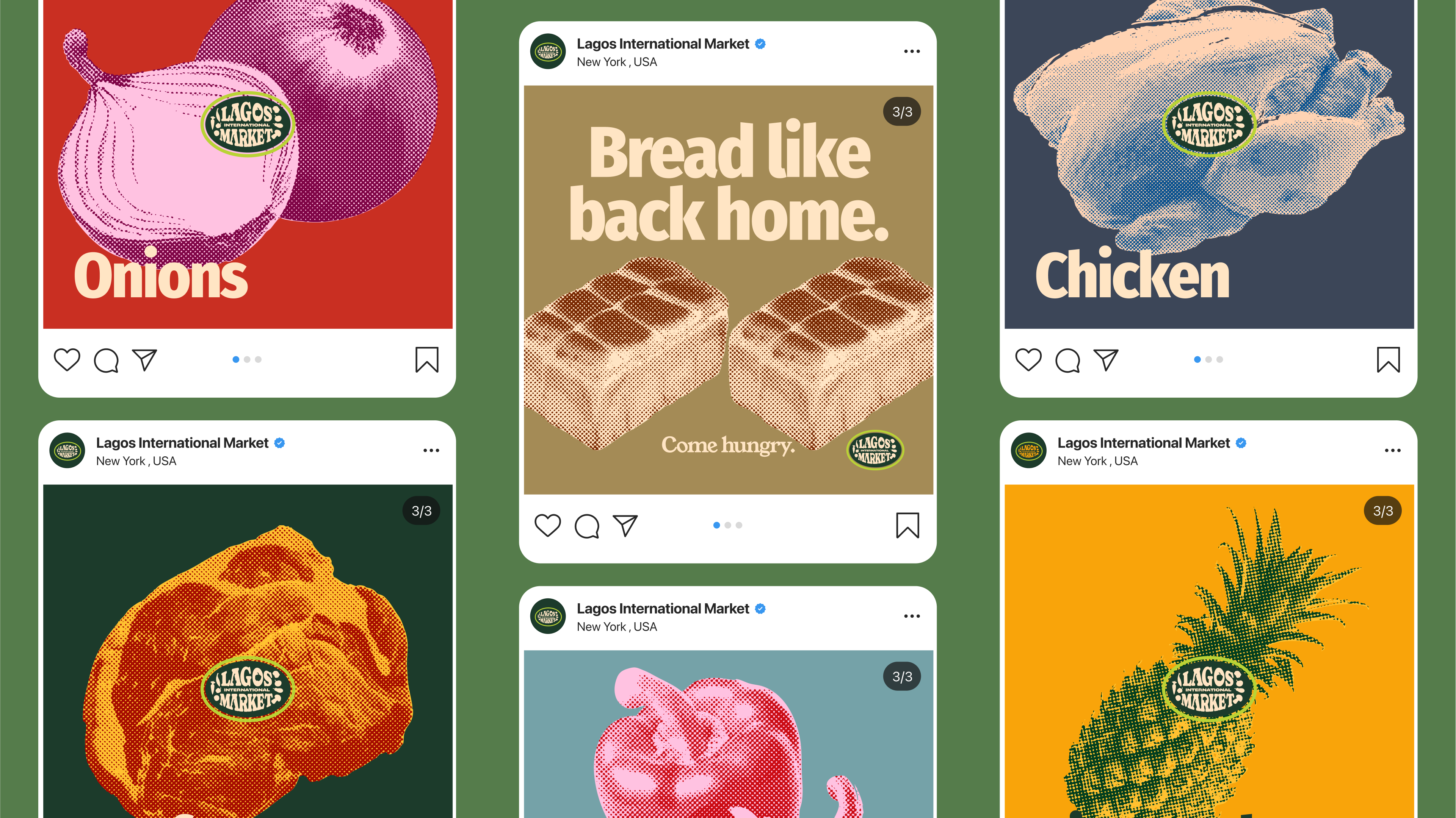
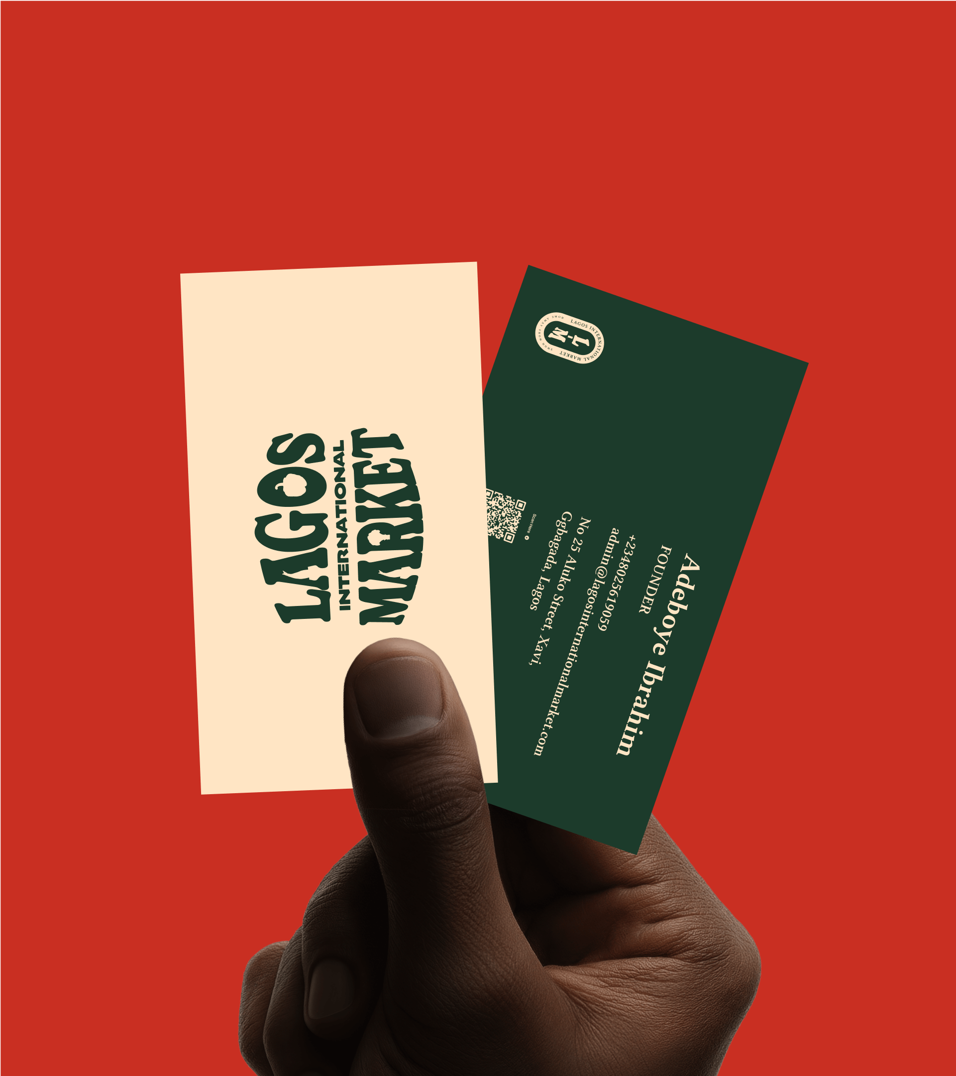
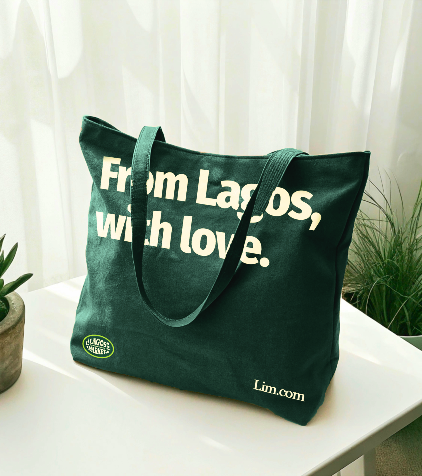
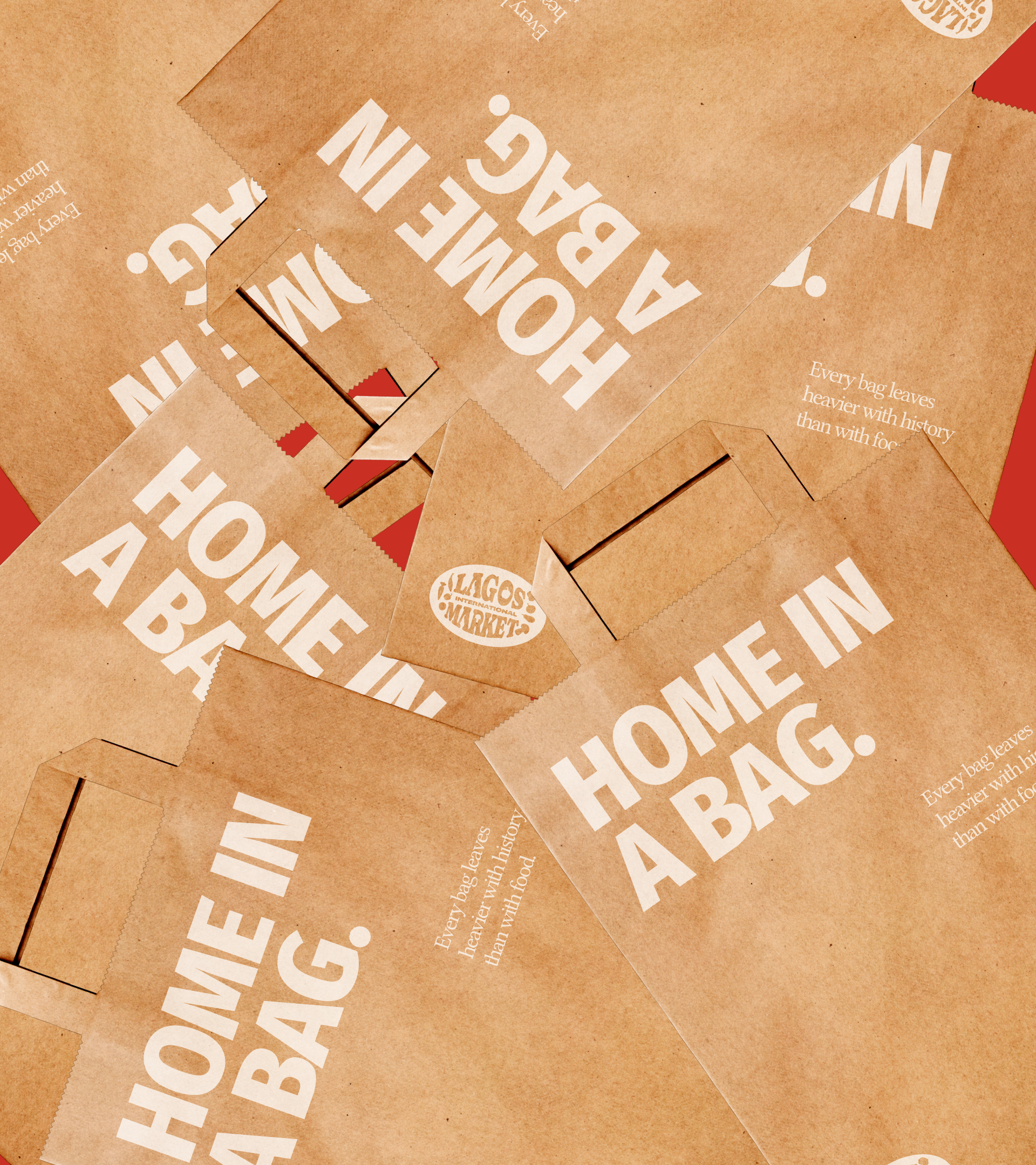
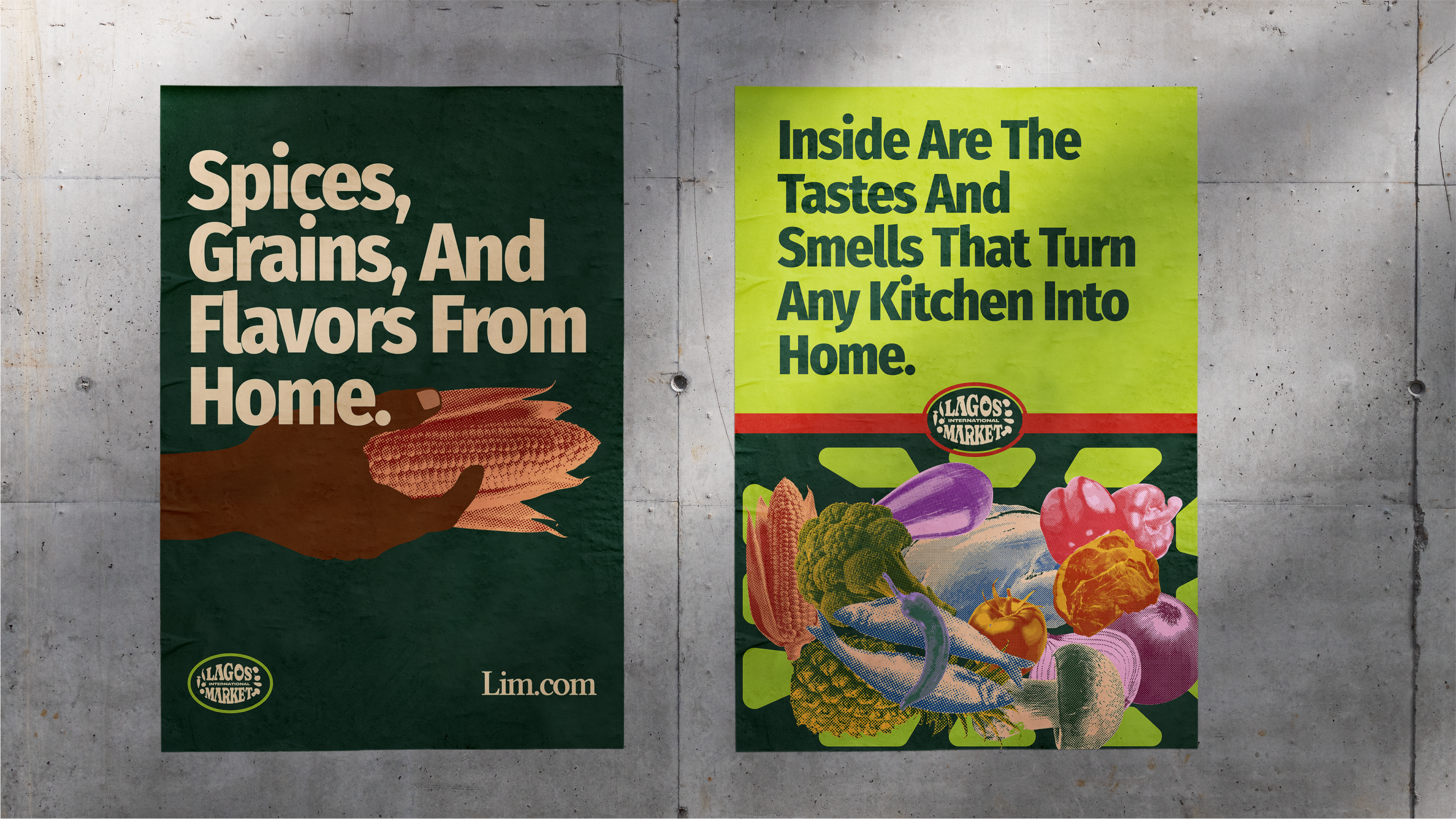
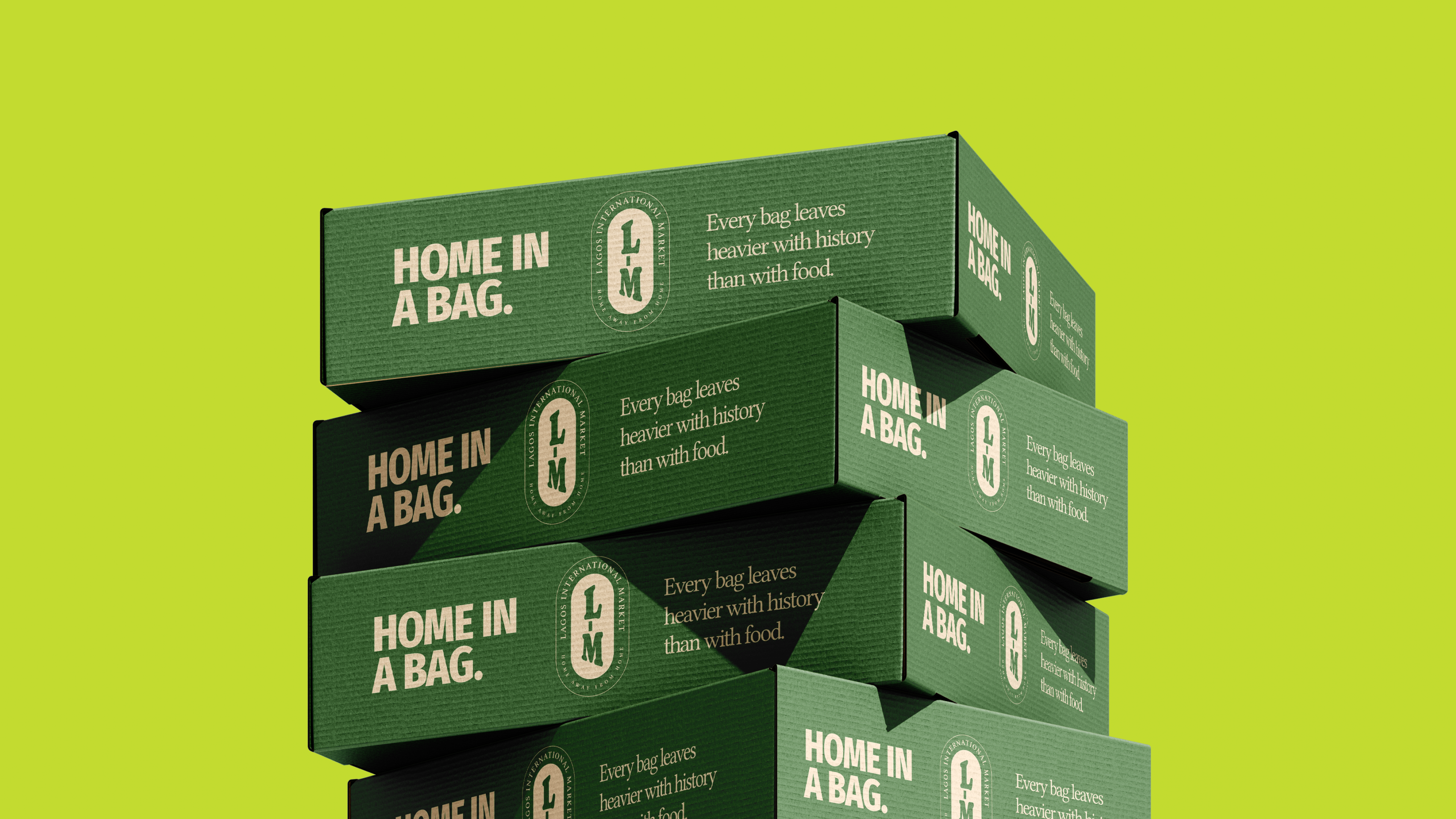
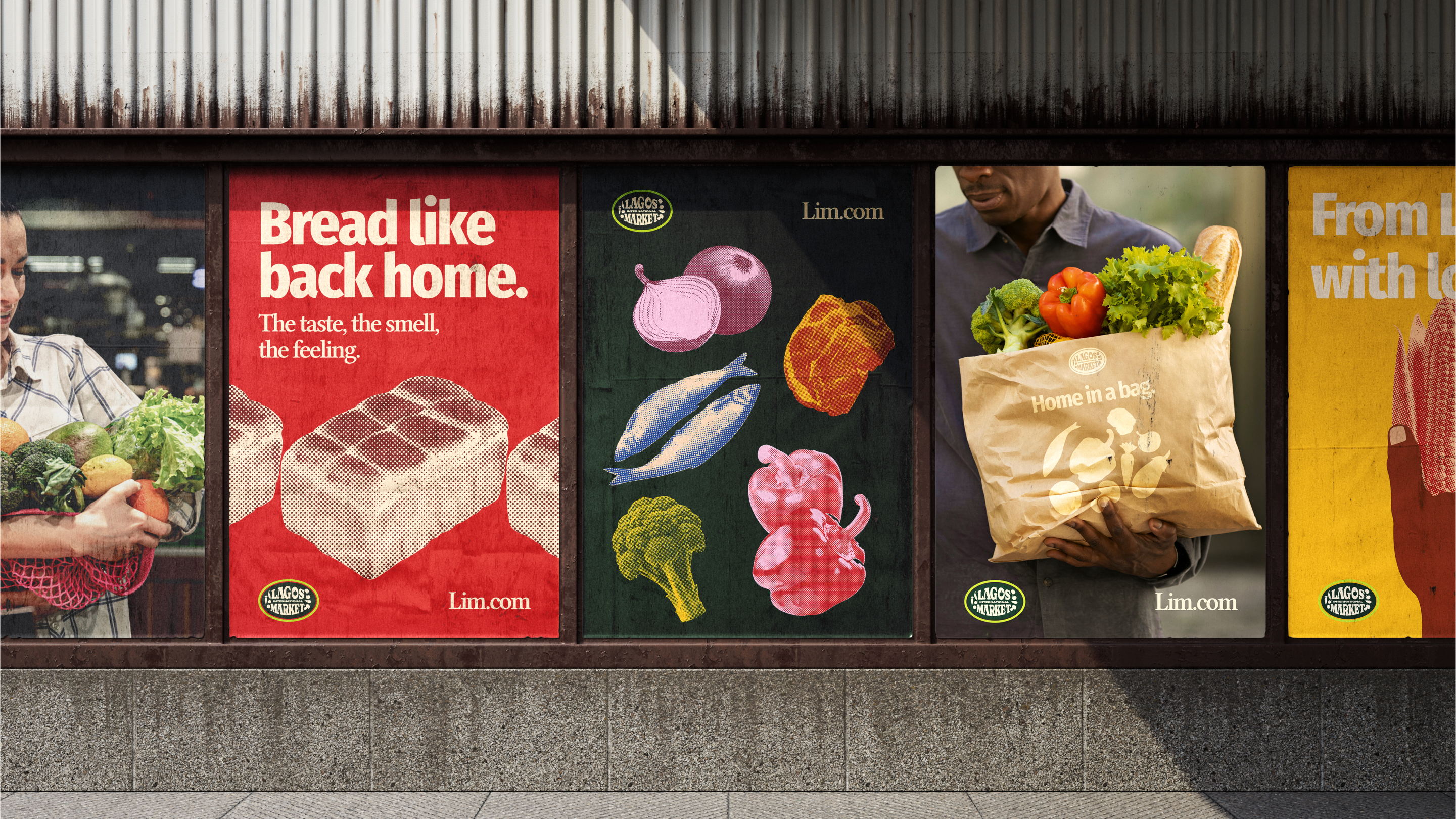
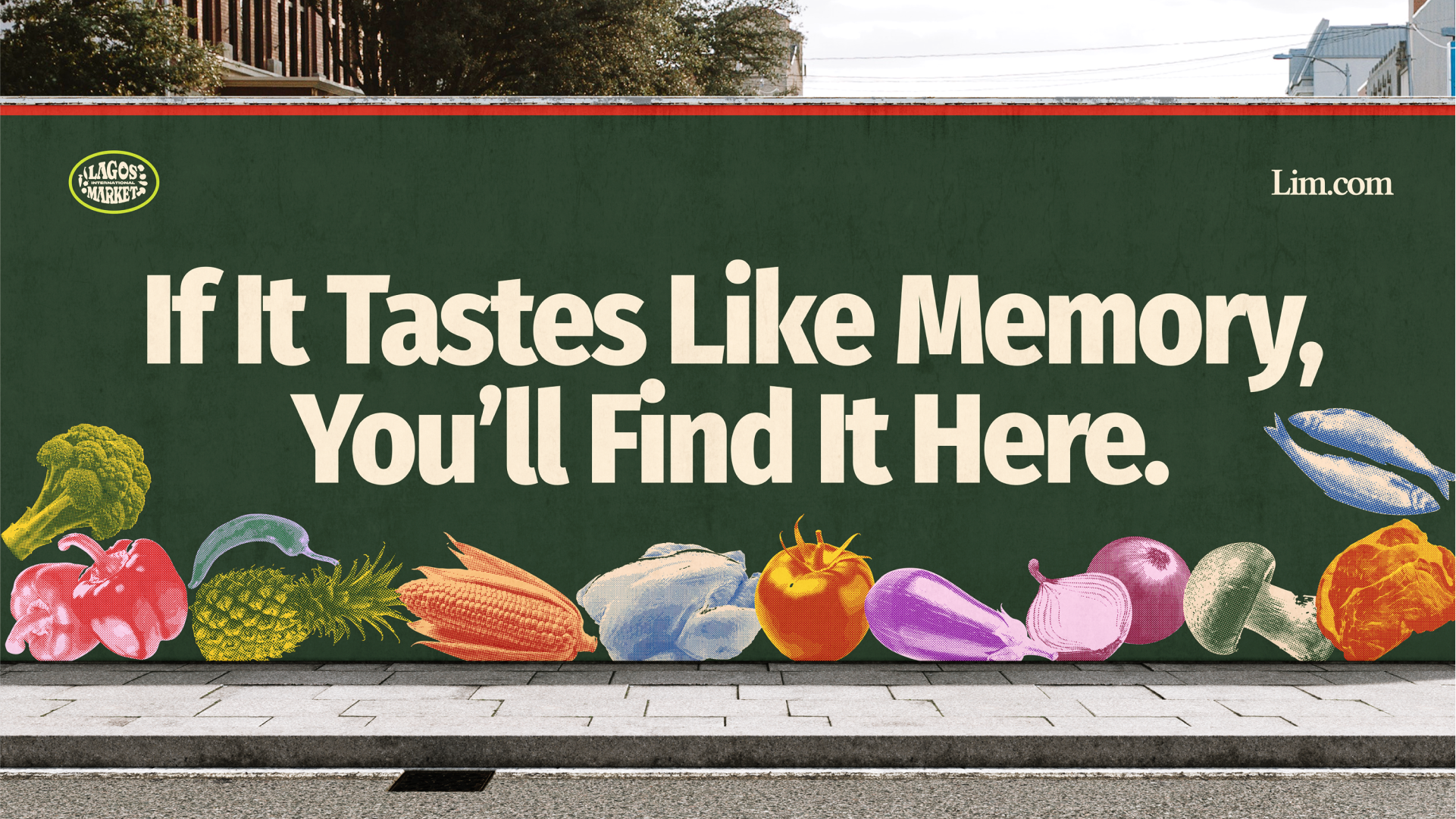
Design: The Lagos International Market logo celebrates timeless market culture. The typography is playful yet bold, echoing the hand-painted signage of classic market stalls.
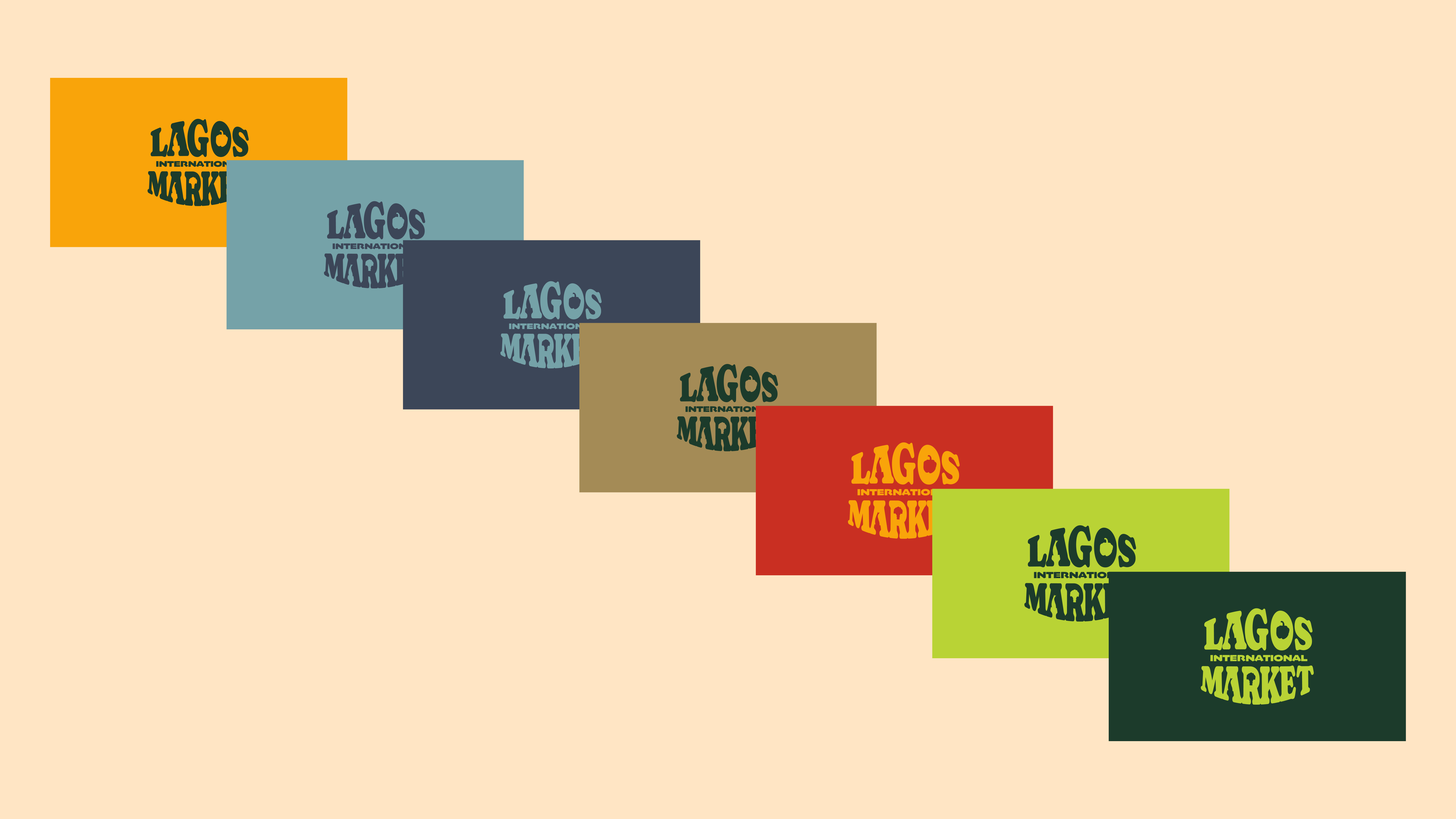
illustration style uses a 2-color halftone treatment inspired by vintage print techniques. Each element is rendered with bold duotone colors. Colors and typography have been carefully selected to evoke emotion, create balance, and maintain consistency across all brand touchpoints.